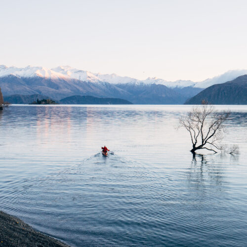
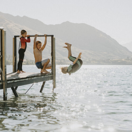
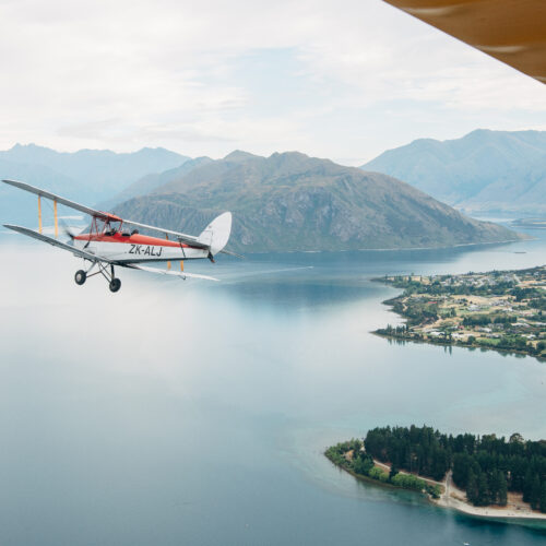
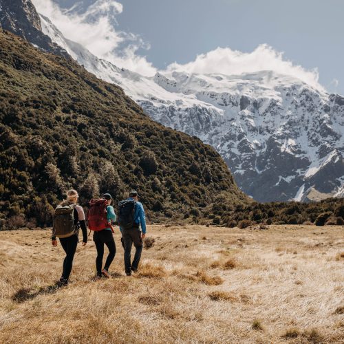
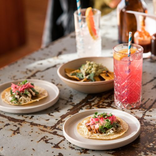
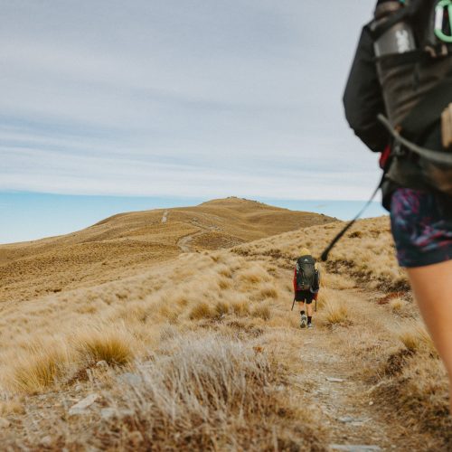
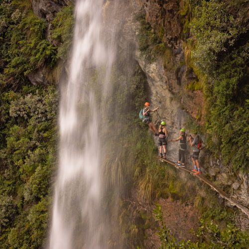
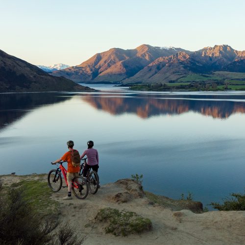
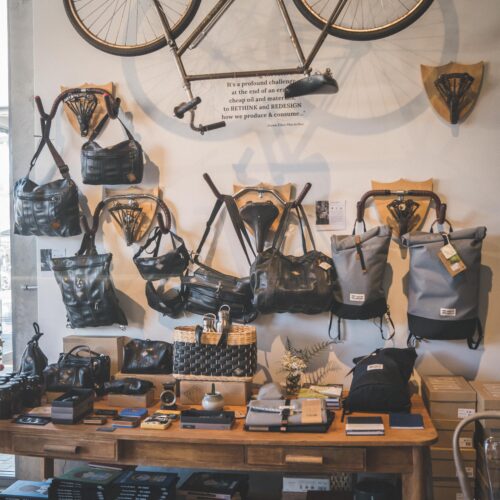
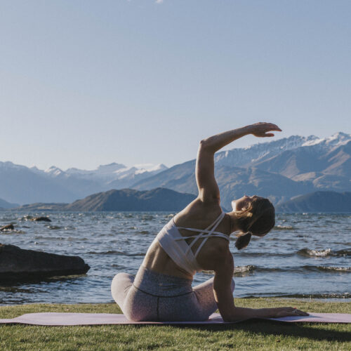
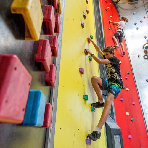
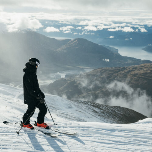
Featured Activities
We’ve taken time to reflect and understand that the Wа̄naka brand should be more representative of our values, our place and our people.
We believe that the Wа̄naka brand plays a critical role in the following areas :
The Wа̄naka brand needed to be true to this place and the people who live here. It needed to be distinctive, with a look and feel all its own. To feel the way that Wа̄naka makes us feel, it needed to be magnetic, and tap into the energy of this incredible place.
The co-creation of the brand was informed by our local people – past and present – with the desire to guide, nurture and inspire for generations to come. We hosted consultations and workshops with internal and external stakeholders, community groups and local businesses, to determine what Wа̄naka means to them and what they wanted to see in the new brand. We then got to work with Studio Acht, a creative studio led by local designer Britt Davies, who has Ngati Rangiwewehi, Ngati Pikiao, Te Ati Awa, and Ngа̄puhi ancestry. Britt was able to harness these sentiments and configure them into a beautiful visual identity – the one that you see throughout this website.
He aha te mea nui te ao
He takata, he takata, he takata
What is the most important thing in the world?
It is the people, it is the people, it is the people
Our new brand identity harnesses the essence of Wānaka—space to breathe, freedom and possibility, natural elemental energy and vitality, a quiet confidence and a casual sophistication. By bringing these elements together, we are able to create a visual language that welcomes our guests and lifts our local communities.
All of our brand elements are in some way inspired by the taoka that surrounds us and are meant to honour a narrative that speaks to our past.
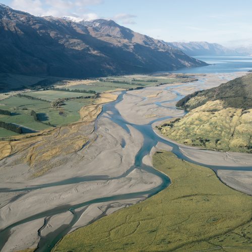
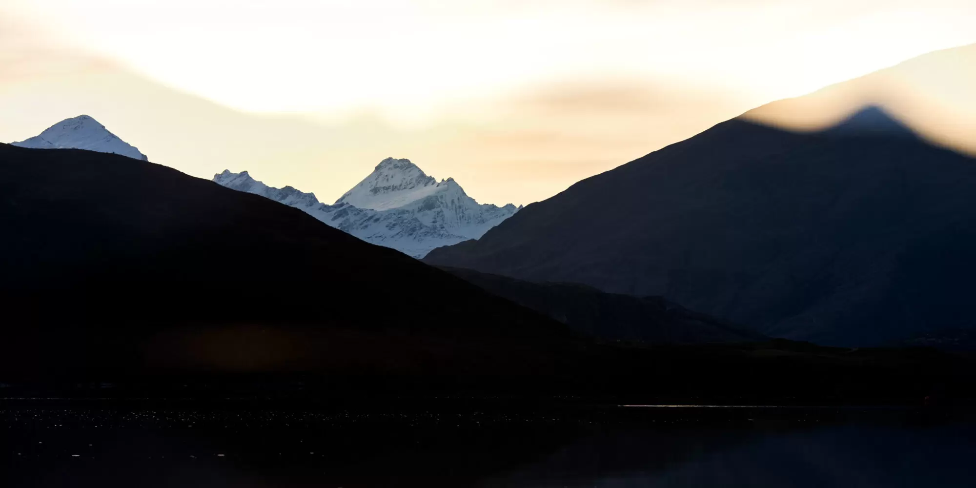
The new graphic devices – those flowing designs you see all over our website – are representative of our Mauka (mountain) and Roto (lake).
In Wānaka, stand on the lakefront and trace your finger along the ridgelines of the Skyline Track over Mt. Roy and out to Coromandel Peak. Mauka is a stylisation of this – an ode to the ridge lines around us that connect the sky to the land.
With the creation of a new brand, we turned next to an evolution of the Wānaka website.
The aim was to create an environment that welcomed visitors, as well as showcased the community and their stories.
In addition to allowing the new brand to shine, the website highlights several core themes. The first is fostering genuine connections, and instilling a feeling of being welcome and invited to share Wānaka with us. We want you to feel the magnetic pull of this place before you even arrive. And we want to grow this connection after you leave, so that you’ll continue to return for years to come.
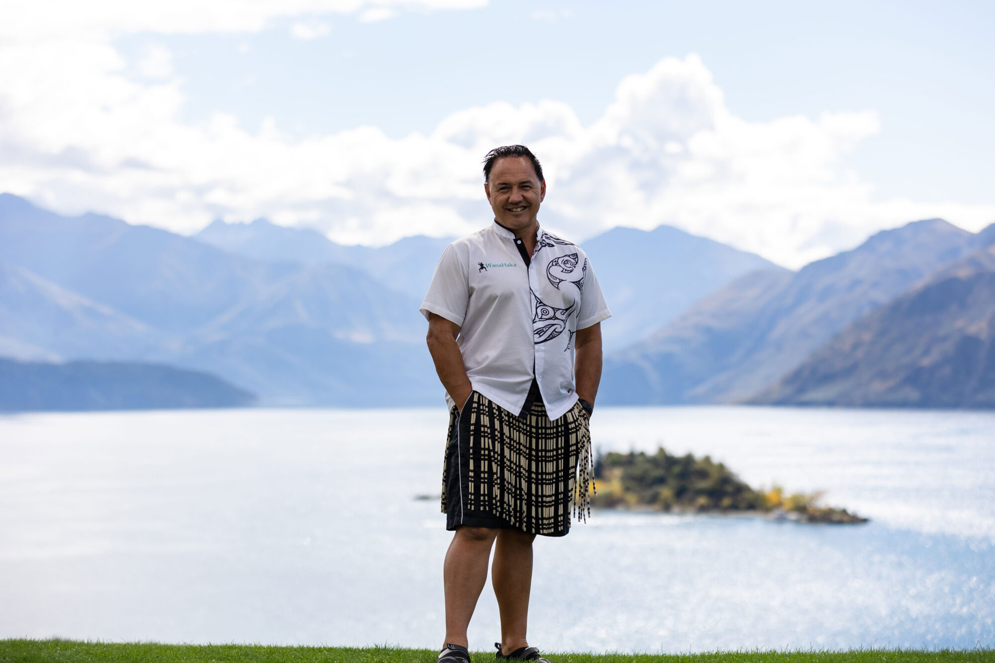
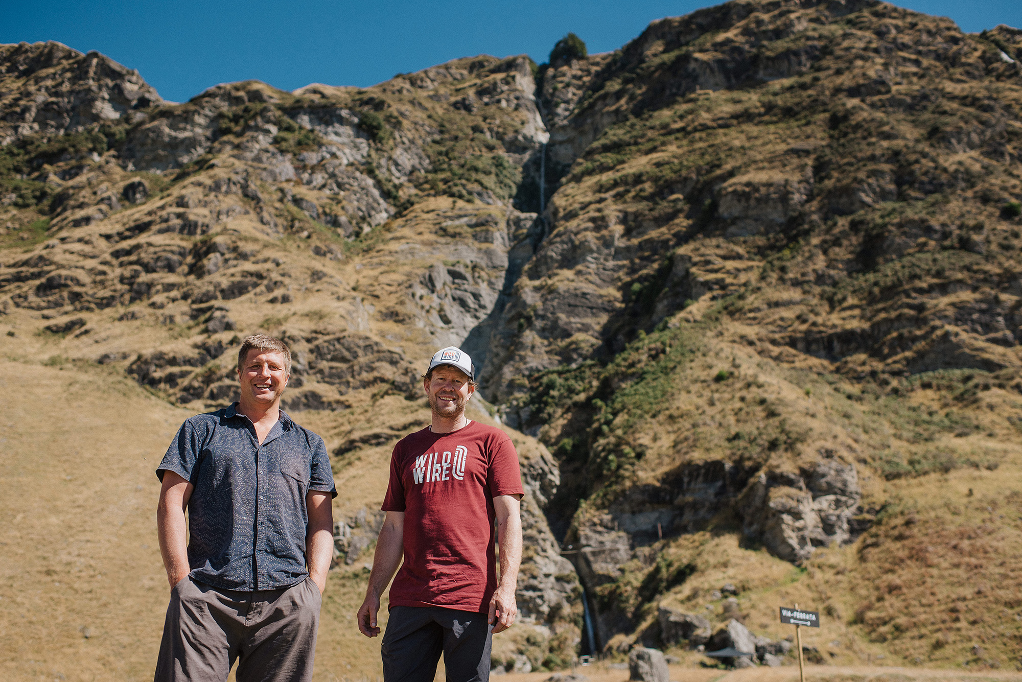
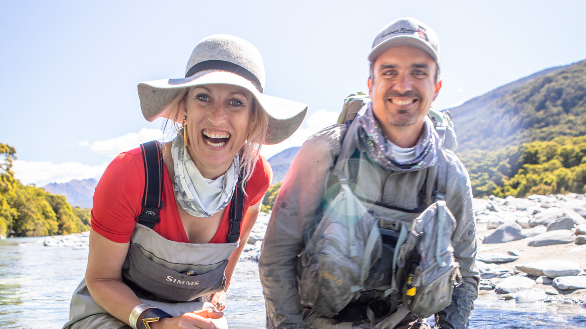
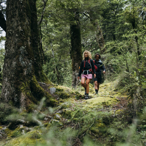
The website also represents authentic adventures that are true to this place. Wānaka adventures are shaped by locals who wish to share their passions with others and want our visitors to experience and love this place as they do. We’ve prioritized a community lens on nearly all of our activity and experience pages.
We hope to welcome you soon. In the meantime, we hope you find inspiration on this beautiful new platform and in all the stories, features and useful information. We invite you to use the My Suitcase tool to keep track of your wishlist of Wānaka experiences as you browse.
To learn more about coming to Wānaka, click here.
Please also consider how to be a responsible traveller as you discover Wānaka by clicking here.